Menu edition
ITSM Designer - Combodo's customers only
The purpose of this view is to edit, create and remove menu entries.
Overview
Clicking on the tab Menus and select the menu item ConfigManagement/Contact gives…
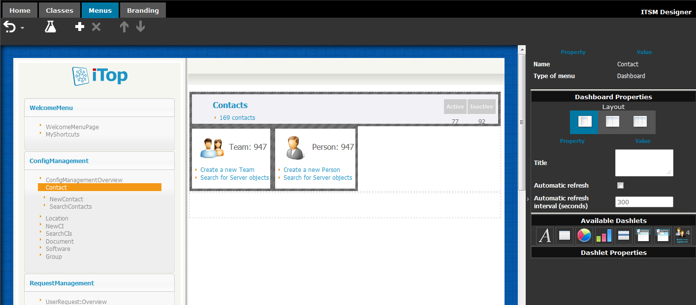
Under the toolbar, the menu editor is divided in three parts:
-
On the left: a WYSIWYG presentation of the whole menu. The presentation differs from the menus shown at run time in that in the Designer, menu groups are constantly opened.
-
In the middle: a preview of the expected outcome when the user will click on the menu at run time. This preview is fake because there is no real life data in the designer. For some types of menus, this can be a WYSIWYG editor.
-
On the right: a property sheet depending on the selected menu and sometimes also depending on the selected item in the middle pane. Changes made here are automatically taken into account by the designer and reflected in the middle pane.
Toolbar
| Icon | In short | More information |
|---|---|---|
| Undo | Click on the button to undo the previous operation, or click on the triangle to select the operations to undo. The button is grayed in case undoing is not allowed (e.g. after a move to production) | |
| Test | Test the latest revision to the active instance. This button is not shown if the active instance has been given the role 'production' | |
| New menu | Opens the dialog box to create a menu. | |
| Delete menu | Deletes the currently selected menu, if this operation is allowed. | |
| Move up | Moves up the currently selected menu, if this operation is allowed and possible (depends on the current position of the selected menu). | |
| Move down | Moves down the currently selected menu, if this operation is allowed and possible (depends on the current position of the selected menu). | |
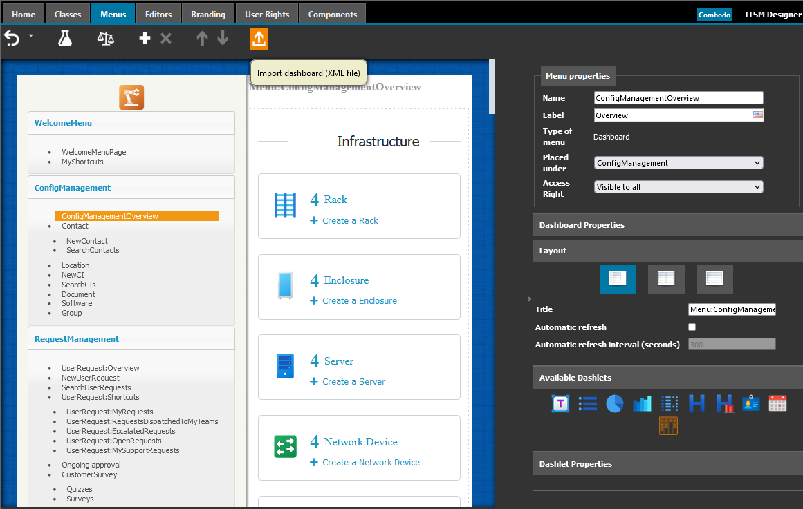
| Import file | Only available for Dashboard
menu: allow to import a dashboard file created on your iTop,
with the export to a file action |
Create a menu
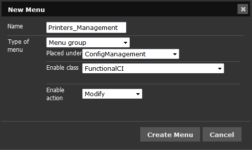
Common properties:
-
Name: the name must NOT contain any white space character. Instead, you have to use underscores, that will be displayed as blanks.
-
Type of menu: when changing this selection, the list of parameters shown above will be adjusted accordingly.
-
Placed under: all types of menu, excepted menu groups, have this property. Select here the container menu. Menu placement can be further adjusted using the
 buttons.
 -
Access Rights: Every menu entry have an associated access right rule
Access Rights rules
-
Visible to all: always visible.
-
Admin only: Only for administrators.
-
Class based: Based on class access rights of the user.
For Class based two additional parameters are used:
-
Enable class: users having a profile allowing to view this class will see the menu.
-
Enable action: modifies the condition so that viewing the menu can be bound to modifying (create and edit) or deleting objects of the given class.
Menu types
Group
A group is a container for other menus.
In iTop, clicking on a menu group toggles between states opened and closed, but it does not change the content of the page.
Web page
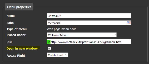
In iTop, such a menu entry is just an hyperlink to an external web site.
-
Prefix by a $$ to specify an absolute URL.
-
Prefix by a $ to specify an URL relative to the iTop root URL.
Exemple: $$http://www.google.com/
Specify on a web page menu node, if the url must
open in a new window or not (default not).
Dashboard
In iTop, clicking on this menu will display an iTop dashboard. The most obvious example of such a dashboard is the Welcome menu (the top level menu in iTop, displayed by default in many circumstances).
Dashboards can be customized at run time, by the end users of iTop.
Customizing dashboard at design time is done in the same WYSIWYG user interface. Therefore, the know-how acquired by reading the chapter Editing Dashboards will be leveraged for design-time dashboards. The only difference is that changes get saved by clicking on a Save button at run time, while they are saved on the fly at design time.
exported to a filePredefined search
A predefined search appears in iTop as a list of objects. This list is built dynamically: its contents are defined by an OQL query, plus optional filtering condition entered by the end user in the search form.
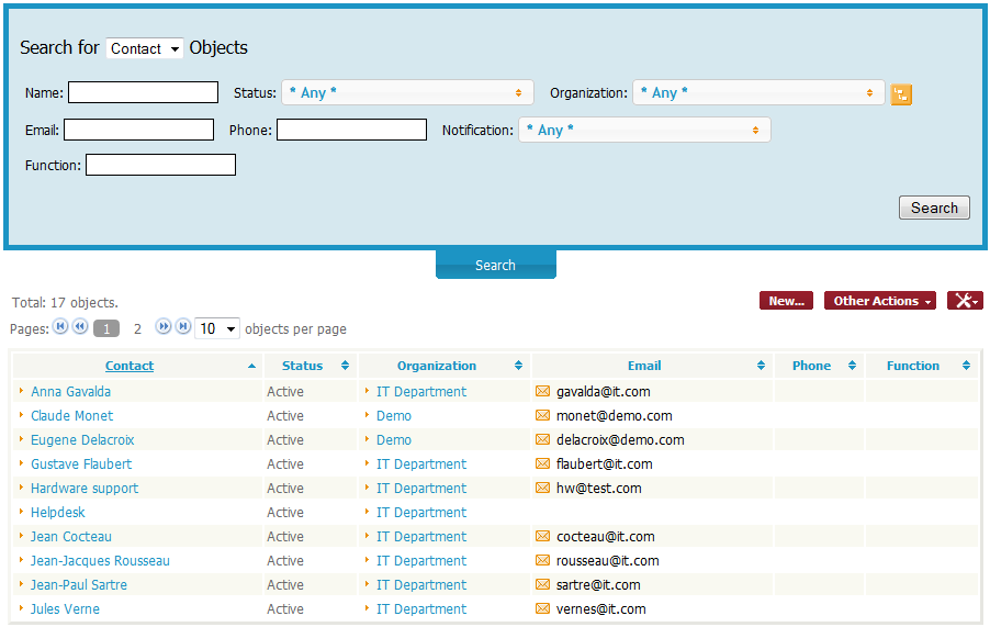
The option Execute the search at first let you specify wether the search will be automatically performed when the user do click on the menu entry, or only when the user clicks on the Search button in the search form.
The resulting list has all the features (menus) that one could expect from a search result in iTop.
New object wizard
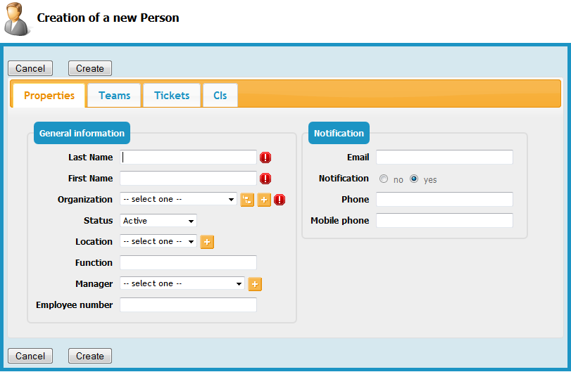
In iTop, clicking this menu opens the wizard to create an object.
Search form
In iTop, clicking this menu opens a standard search form.

As opposed to the predefined search, the default scope is all the objects of the target class.

