Attributes visual beautifier
- name:
- Attributes visual beautifier
- description:
- Bootstraps your iTop with some nice status attributes
- version:
- 1.0.1
- release:
- 2024-08-30
- itop-version-min:
- 2.7.0
- code:
- combodo-attributes-visual-beautifier
- state:
- Stable
- diffusion:
- iTop Hub
- php-version-max:
- PHP 8.3
This extension bootstraps your iTop with some nice status attributes. 🚀
Features
From 3.0.0, it only affects the User Portal(s), as those features were included in XML
Make the status field value more visible and much
easier to be understood thanks to colors. By
default UserRequest and Contact classes
have their status values colored But other classes can be
added.
Color palette
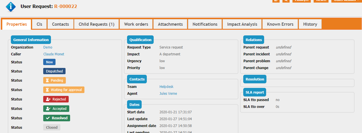
We based the default colors on what seems to be a general standard for UX:
  Neutral states => Blue (New, assigned, re-assigned, dispatched, ...)
  Waiting states => Orange (Pending, waiting for approval)
  Success states => Green (Accepted, resolved)
  Failure states => Red (Rejected, escalated TTO/TTR)
  Frozen states => Grey (Closed)
Note: Custom states will be rendered as neutral states by default.
Above example of a UserRequest (mockup with all state values)
Revision History
| Version | Release Date | Comments |
|---|---|---|
| 2024-08-30 | 1.0.1 | * N°7146 - Fix style not applied in list in the
end-users portal in iTop 3.0+ * N°7167 - PHP 8.3: Fix usages of get_class() without argument |
| 2020-04-14 | 1.0.0 | First version |
Limitations
-
This extension can only highlights one field per class and the field values must not start with a number.
-
This extension is designed for iTop 2.7.
-
On iTop version above 3.0.0, this extension only applies on User Portal(s), it has no effect on console/back-office, which do have their own highlighting mechanisms in XML.
Requirements
Requires iTop 2.7
Installation
Use the Standard installation process for this extension.
Configuration
Configuration for this extension, like colors, status and objects in scope of the highlighting, can be done in XML. For Combodo's Customer it can easily be done using the ITSM Designer, editing the Module Parameter: combodo-attributes-visual-beautifier.
Editing those parameters in the Configuration file is also possible but not recommended as it won't be compatible with future version of that extension and for Combodo's customers it will ruin our capability to help you keeping your settings while moving to iTop 3.0+
Usage
This extension only changes a little the way the objects with a
status field are displayed in the Console and the
Portal, in list mode and in the details view
Portal screenshots
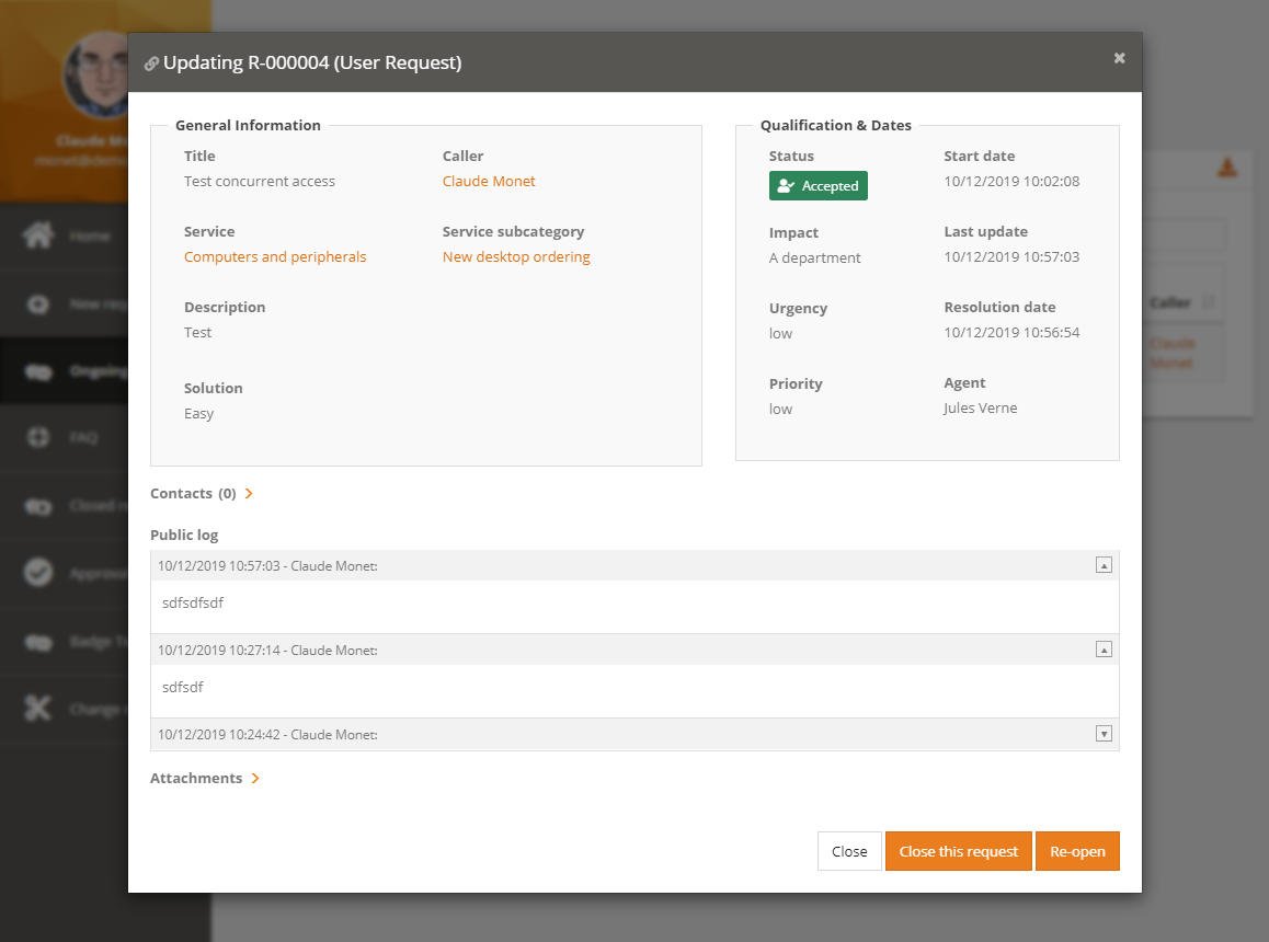
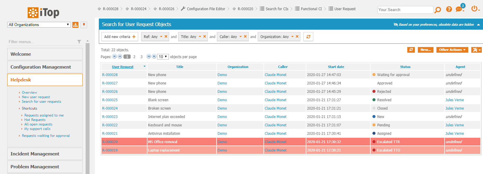
Here is the way an object with a status field would
be displayed in the user Portal:
Objects list:
Object details:
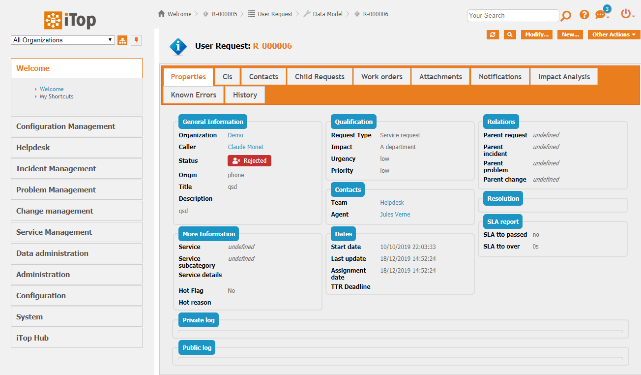
Console screenshots
Used colors
We based the default colors on what seems to be a general standard for UX, but of course this can be overloaded (see Question & Answers section):
  Neutral states => Blue (New, assigned, re-assigned, dispatched, ...)
  Waiting states => Orange (Pending, waiting for approval)
  Success states => Green (Accepted, resolved)
  Failure states => Red (Rejected, escalated TTO/TTR)
  Frozen states => Grey (Closed)
Note: Custom states will be rendered as neutral states by default.
Questions and Answers
Question: I have custom states, how can I set their
color?
Answer: To make customization easier within the ITSM Designer, you
can edit the module parameters of the extension to add you
states.
For example, if you have a custom state “customer_pending” for the “UserRequest” class, add the state to the module parameters and set its style like this:
<?xml version="1.0" encoding="UTF-8"?>
<itop_design xmlns:xsi="http://www.w3.org/2001/XMLSchema-instance" version="1.7">
    <module_parameters>
        <parameters id="combodo-attributes-visual-beautifier">
            <classes type="hash">
                <UserRequest>
                    <field_values>
                        <customer_pending _delta="define">
                            <primary_color>#EA7D1E</primary_color>
                            <secondary_color>#FFFFFF</secondary_color>
                            <icon_code>f254</icon_code>
                        </customer_pending>
                    </field_values>
                </UserRequest>
            </classes>
        </parameters>
    </module_parameters>
</itop_design>
The 3 tags are optional, if not defined the value from the <default_style> of the class will be taken.
-
primary_color: Used as background in the details, used as the dot color in lists.
-
secondary_color: Used as text / icon color in the details, not used in the lists.
-
icon_code: Code of the FontAwesome icon to display in the details. See next question more information.
Tips:
-
For re-using colors from the existing states, use the variables below.
-
For good color palette example, check TailWind.
Color variables from existing states:
$state-neutral-primary-color
$state-neutral-secondary-color
$state-waiting-primary-color
$state-waiting-secondary-color
$state-success-primary-color
$state-success-secondary-color
$state-failure-primary-color
$state-failure-secondary-color
$state-frozen-primary-color
$state-frozen-secondary-color

$status-active-primary-color
$status-active-secondary-color
$status-inactive-primary-color
$status-inactive-secondary-color
Question: Where can I found icons to set on some
states?
Answer: The extension supports any icons from the Font Awesome 5 Free collection.
-
To set a icon, first browse the collection to find one you like.
-
Then, copy the “icon code” (it's a 4-character code).
-
Finally, add it to your XML.
<?xml version="1.0" encoding="UTF-8"?>
<itop_design xmlns:xsi="http://www.w3.org/2001/XMLSchema-instance" version="1.7">
    <module_parameters>
        <parameters id="combodo-attributes-visual-beautifier">
            <classes type="hash">
                <UserRequest>
                    <field_values>
                        <dispatched>
                            <icon_code _delta="force">f0c0</icon_code>
                        </dispatched>
                    </field_values>
                </UserRequest>
            </classes>
        </parameters>
    </module_parameters>
</itop_design>
Question: Can this highlighting be limited to the
Console or the Portal?
Answer: Yes
- itop_design / module_parameters
-
   <parameters id="combodo-attributes-visual-beautifier">
       <disabled_portals>
           <portal id="itop-portal" _delta="define">itop-portal</portal>
       </disabled_portals>
   </parameters>
Here is how to remove the highlighting from the console, and keep it on all other portals
- itop_design / module_parameters
-
   <parameters id="combodo-attributes-visual-beautifier">
       <disabled_portals type="array" _delta="redefine">
           <portal id="backoffice">backoffice</portal>
       </disabled_portals>
   </parameters>
Question: How can I apply this highlighting to
Change?
Answer: Just use this module parameters
- itop_design / module_parameters
-
<parameters id="combodo-attributes-visual-beautifier" _delta="must_exist">
      <classes type="hash">
        <Change _delta="define">
          <default_style>
            <primary_color>$state-neutral-primary-color</primary_color>
            <secondary_color>$state-neutral-secondary-color</secondary_color>
          </default_style>
          <field_code>status</field_code>
          <field_values type="hash">
            <approved>
              <primary_color>$state-success-primary-color</primary_color>
              <secondary_color>$state-success-secondary-color</secondary_color>
              <icon_code>f4fc</icon_code>
            </approved>
            <assigned>
              <primary_color>$state-neutral-primary-color</primary_color>
              <secondary_color>$state-neutral-secondary-color</secondary_color>
            </assigned>
            <closed>
              <primary_color>$state-frozen-primary-color</primary_color>
              <secondary_color>$state-frozen-secondary-color</secondary_color>
            </closed>
            <implemented>
              <primary_color>$state-success-primary-color</primary_color>
              <secondary_color>$state-success-secondary-color</secondary_color>
              <icon_code>f00c</icon_code>
            </implemented>
            <monitored>
              <primary_color>$state-success-primary-color</primary_color>
              <secondary_color>$state-success-secondary-color</secondary_color>
              <icon_code>f00c</icon_code>
            </monitored>
            <new>
              <primary_color>$state-neutral-primary-color</primary_color>
              <secondary_color>$state-neutral-secondary-color</secondary_color>
            </new>
            <notapproved>
              <primary_color>$state-failure-primary-color</primary_color>
              <secondary_color>$state-failure-secondary-color</secondary_color>
              <icon_code>f235</icon_code>
            </notapproved>
            <plannedscheduled>
              <primary_color>$state-waiting-primary-color</primary_color>
              <secondary_color>$state-waiting-secondary-color</secondary_color>
              <icon_code>f252</icon_code>
            </plannedscheduled>
            <rejected>
              <primary_color>$state-failure-primary-color</primary_color>
              <secondary_color>$state-failure-secondary-color</secondary_color>
              <icon_code>f235</icon_code>
            </rejected>
            <validated>
              <primary_color>$state-success-primary-color</primary_color>
              <secondary_color>$state-success-secondary-color</secondary_color>
              <icon_code>f4fc</icon_code>
            </validated>
          </field_values>
        </Change>
      </classes>
    </parameters>
Default Configuration
- Configuration file
-
'combodo-attributes-visual-beautifier' => array (
    'disabled_portals' => array (),
    'default_style' => array (
      'primary_color' => '$state-neutral-primary-color',
      'secondary_color' => '$state-neutral-secondary-color',
    ),
    'classes' => array (
      'UserRequest' => array (
        'default_style' => array (
          'primary_color' => '$state-neutral-primary-color',
          'secondary_color' => '$state-neutral-secondary-color',
        ),
        'field_code' => 'status',
        'field_values' => array (
          'new' => array (
            'primary_color' => '$state-neutral-primary-color',
            'secondary_color' => '$state-neutral-secondary-color',
          ),
          'escalated_tto' => array (
            'primary_color' => '$state-failure-primary-color',
            'secondary_color' => '$state-failure-secondary-color',
            'icon_code' => 'f06d',
          ),
          'escalated_ttr' => array (
            'primary_color' => '$state-failure-primary-color',
            'secondary_color' => '$state-failure-secondary-color',
            'icon_code' => 'f06d',
          ),
          'assigned' => array (
            'primary_color' => '$state-neutral-primary-color',
            'secondary_color' => '$state-neutral-secondary-color',
          ),
          'waiting_for_approval' => array (
            'primary_color' => '$state-waiting-primary-color',
            'secondary_color' => '$state-waiting-secondary-color',
            'icon_code' => 'f252',
          ),
          'approved' => array (
            'primary_color' => '$state-success-primary-color',
            'secondary_color' => '$state-success-secondary-color',
            'icon_code' => 'f4fc',
          ),
          'rejected' => array (
            'primary_color' => '$state-failure-primary-color',
            'secondary_color' => '$state-failure-secondary-color',
            'icon_code' => 'f235',
          ),
          'pending' => array (
            'primary_color' => '$state-waiting-primary-color',
            'secondary_color' => '$state-waiting-secondary-color',
            'icon_code' => 'f252',
          ),
          'dispatched' => array (
            'primary_color' => '$state-neutral-primary-color',
            'secondary_color' => '$state-neutral-secondary-color',
          ),
          'redispatched' => array (
            'primary_color' => '$state-neutral-primary-color',
            'secondary_color' => '$state-neutral-secondary-color',
          ),
          'closed' => array (
            'primary_color' => '$state-frozen-primary-color',
            'secondary_color' => '$state-frozen-secondary-color',
          ),
          'resolved' => array (
            'primary_color' => '$state-success-primary-color',
            'secondary_color' => '$state-success-secondary-color',
            'icon_code' => 'f00c',
          ),
        ),
      ),
      'Contact' => array (
        'field_code' => 'status',
        'field_values' => array (
          'active' => array (
            'primary_color' => '$status-active-primary-color',
            'secondary_color' => '$status-active-secondary-color',
          ),
          'inactive' => array (
            'primary_color' => '$status-inactive-primary-color',
            'secondary_color' => '$status-inactive-secondary-color',
          ),
        ),
      ),
    ),
  ),
iTop 3.0 Console
Q: I have upgraded to iTop 3.0.0 or above, and the
extension does not work anymore in the Console?
A: Because the markup has totally changed in 3.0,
this extension does not use the appropriate markup and was not
updated.
In order to retrieve the behavior you had in the Console, you must configure icons and colors you want, directly in XML datamodel.


